
Our Brand
Our DivideBuy logo, badge and icon are our most important visual assets. Use these assets to start promoting DivideBuy on your website as a payment option. Our logos are available in jpeg and png formats. You can also find our Branding Guide for logo use below.
Our Logo
The DivideBuy logo is the face of the brand and has been designed as a whole, not to be separated.
Consistent use will ensure greater recognition for the brand.
The logo has been specially crafted so it is well balanced and unique to the brand.
It must always be reproduced from approved artwork.
The following guidelines will show you how to use the logo correctly and consistently for clear and impactful communication.

Our Logo Colour Variations
Whenever possible, our main logo should be used in its original format. However, there will be occasions where an alternative version will be required for legibility purposes.
The following variations are permitted:
- Inverted Electric Blue
- Inverted Midnight Blue
- One colour White
- One colour Black
- Greyscale
Make sure approved artwork only is used at all times.
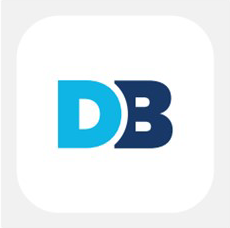
Our Logo Mark
Separate from the main logo is also a logo mark which consists of the DB initials. This is always used on a Midnight Blue rounded square or Midnight Blue/Electric Blue on a rounded white square. On partner sites, it may be greyscale.
Clear Space and Minimize Size
The logo is displayed to best effect when it is positioned within its own clear space. This means that no other elements must fall within it (e.g. text or images). To define this space, the ‘D’ from Divide is used as a measuring device.
Minimum Logo Size for Print
To ensure the logo is always legible, it should never be used smaller than 30 x 7.5mm.
Minimum Logo Size for Digital
To ensure the logo is always legible, it should never be used smaller than 80 x 20.5px.
Our Colours
Thinking about using our brand colours to enhance your financial promotions? Take your pick!
#002f6d
#00b3e3
#FFFFFF
#00d9c5